In Q1 2017, Keen IO embarked on an ambitious transformation, switching from a tiered pricing system to a dynamic, usage-based billing model. The heart of this transition was the creation of a comprehensive dashboard that allowed users to track their usage and estimate costs seamlessly.
The transition to metered billing was multifaceted and required an ambitious platform-wide expansion of instrumentation, as well as a brand new user interface that clearly and intuitively communicated all of this new information.
As the product and design lead, my role was to synthesize extensive service data into a coherent visual narrative. This meant:
- Collaborating with cross-functional teams, including Customer Success and Support, to gauge user expectations for data density and granularity.
- Adapting to an evolving data landscape, with upstream changes directly impacting the design's scope and capabilities.
- Designing a user interface that transformed raw metrics into understandable, actionable insights.
The central questions guiding the design process were:
- Awareness: How can we present service usage in a way that users can effortlessly monitor and understand cost implications?
- Action: What minimal actions do we want users to take, and how can we alert them to potential issues?
- Assurance: Can we instill confidence that users will not encounter surprises with their billing?
Or, put another way:
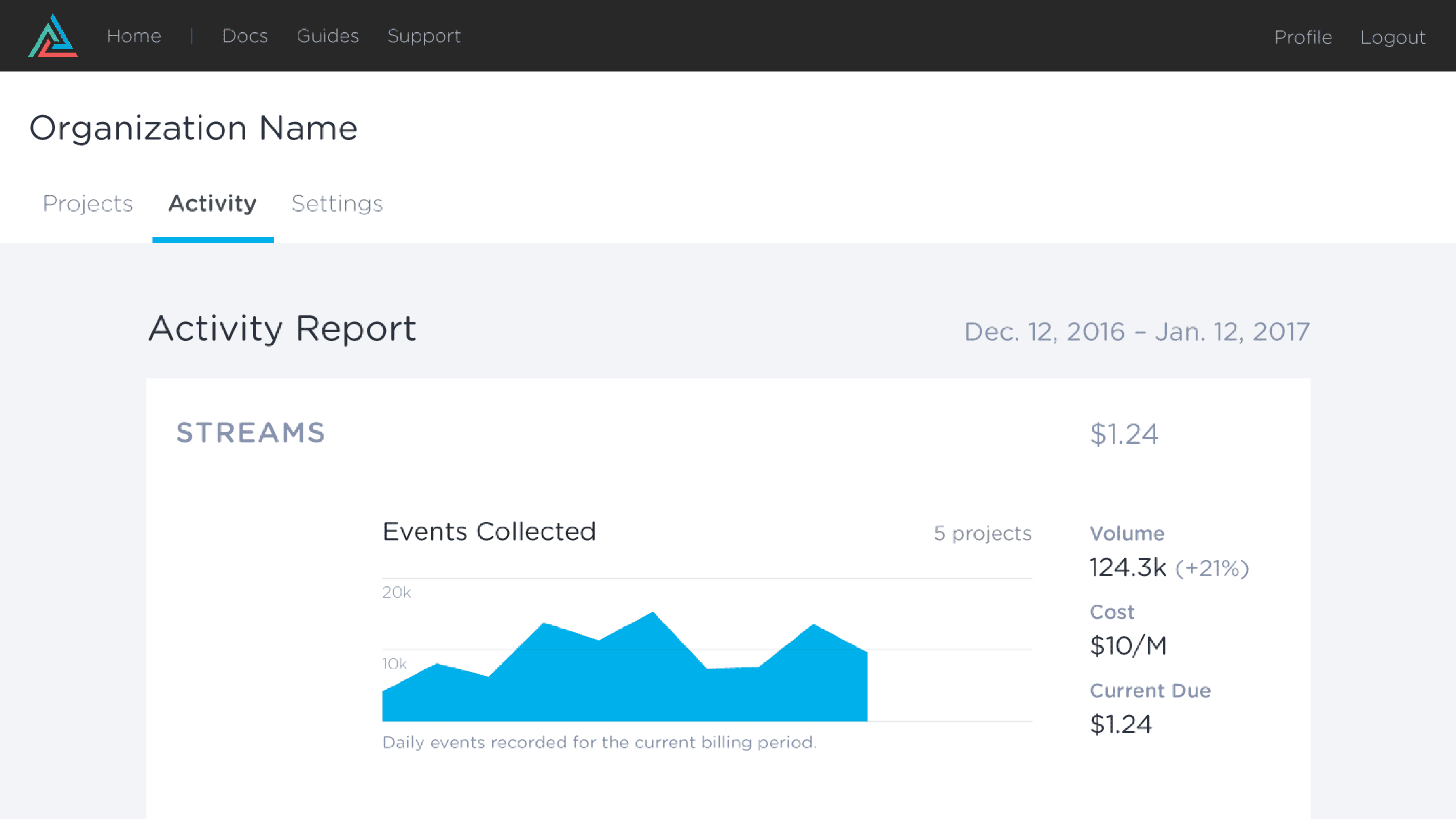
The essential function of this interface is to communicate just enough information so that a user can follow the cost curve of their implementation and to see how their decisions translate into real dollars.
Ideally, the user shouldn't need to do anything. However, if a problem should arise, this is where it might first become visible. A sudden spike or drop in activity could mean a lot of things – good or bad. The job of this interface is to simply make that known.
We want our customers to feel confident that implementation of our platform is continuing as expected, and to trust that they won't be blindsided by a future invoice.
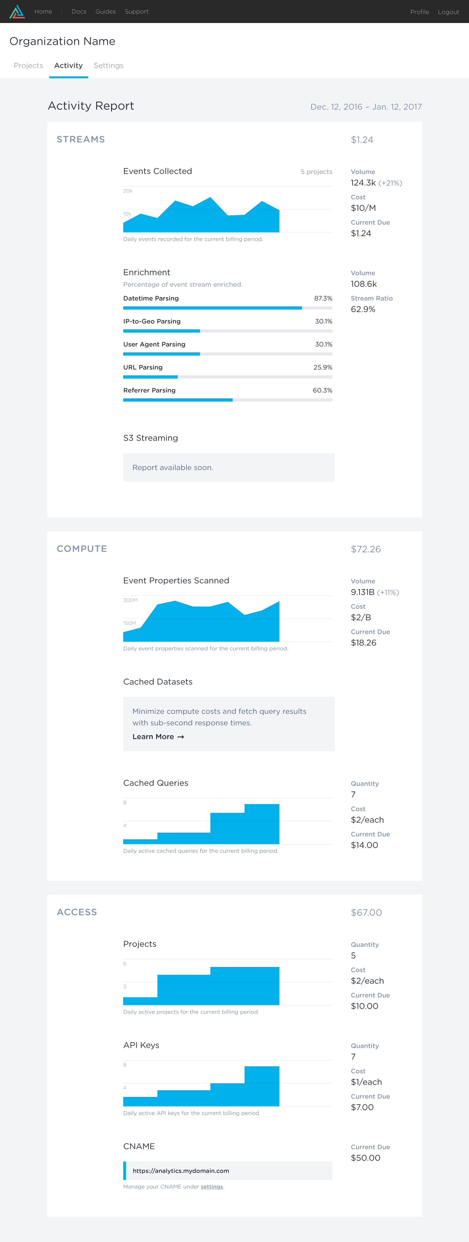
In response to these guiding questions, I developed a minimalistic yet informative dashboard, featuring:
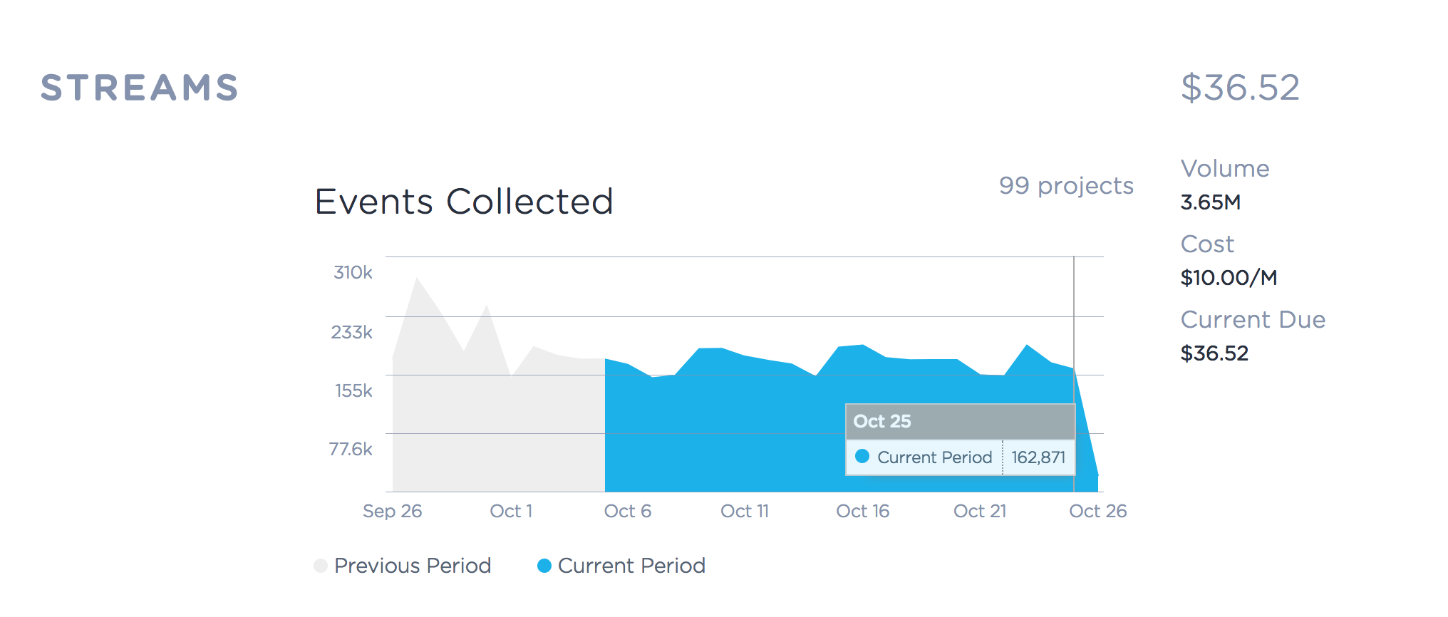
- Area charts comparing current and past billing cycles.
- Simplified metrics to aid quick comprehension without overwhelming users with data.
- Streamlined layout that promoted ease of use and clarity.
In addition to driving the product and design work streams, I also assisted with the development of our new dashboard. Here are a few highlights:
- We used ES6 classes to manage app state and API interactions, ensuring a modular and maintainable codebase.
- We utilizing our open source data visualization SDK for creating responsive, stylized area charts.
- We used the Tachyons CSS framework to accelerate development and standardize design patterns across our platform.
The initiative driving this project, as a whole, represented a major strategic pivot in customer engagement and transparency. By making service usage and billing clear and predictable, this dashboard helped facilitate that shift while significantly improved the self-serve account management experience.