This is one part of a comprehensive breakdown of my work with Macrometa. Looking for the entry point? Start here or explore related projects below.
My very first engagement with Macrometa was to redesign their web console. This web app serves as the primary user interface for the platform, and supports a long list of both customer-facing and internal use cases.
The initial version of this app was based on a hard fork of an open source dashboard, which was both functionally and aesthetically quite limited, to put it nicely. It was also written in BackboneJS, a relic JavaScript framework from the early days of the interactive web. This is all to say the original version had become a big, ugly mountain of technical debt and glaring usability issues.


In addition to the design work outlined here and across other related projects, I also advised the web engineering team on a complete rebuild of this app, migrating from BackboneJS to a modern React app architecture. From the very beginning, we prioritized solid UI component patterns, tooling, and best practices that would enable the Macrometa Design System. For the purpose of this article, I'll keep the focus here on the design work that happened in parallel.
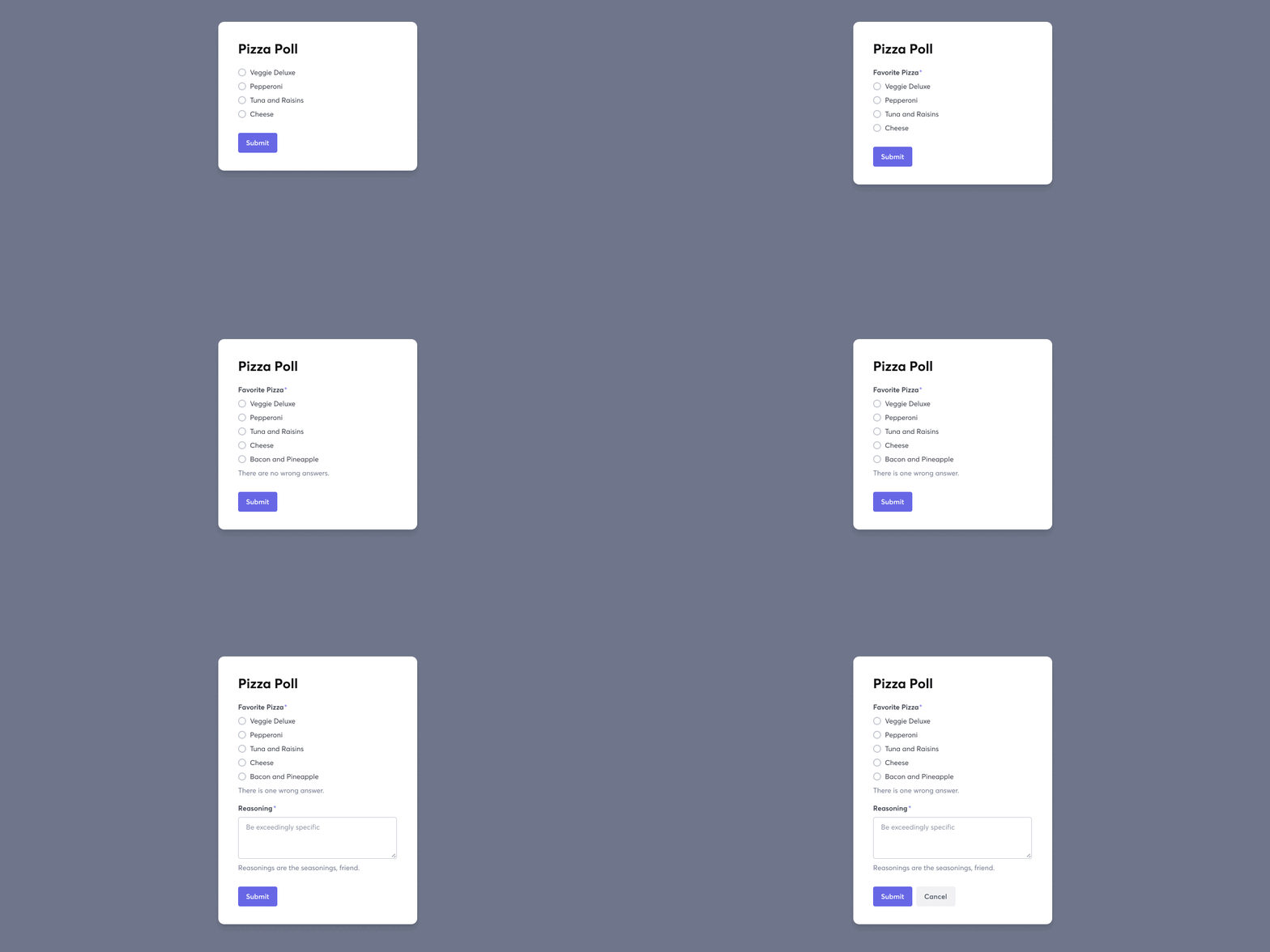
With a big redesign like this, the goal wasn't simply to create a nicer-looking app or snappier interactions. I wanted to establish a solid foundation that could support long-term cohesion and continuity, across an ever-evolving platform.
I wanted a system that could be applied to any number of standalone apps, including demo apps, internal tools, prototypes, our docs site, or our marketing website, and know that we could produce high quality interfaces with little to no "wheel-reinvention" along the way.
To accomplish this, the focus from day one was on gradually curating and evolving this underlying system, through the ongoing experimentation and refinement of every other thing we created. That process began with the web console.
Here are a few guiding ideals that shaped the work:
- Clean, well-defined foundations - styles, typography, and color palette
- Precise and consistent use of spacing, widths, and type sizes and styles
- Direct, unambiguous copy with a clear, helpful tone
- Simpe, minimalist patterns, layouts, and feedback mechanisms
I also have an ever-growing collection of frameworks and methodologies that I'll use when developing interfaces. I like to use the following framing to evaluate every moment in a user journey or activity sequence:
- "What do you want me to know?" – if the user only notices one thing from the current view, what should it be?
- "What do you want me to do?" - is an action is required by the user? If so, make this immediately clear and unambiguous.
- "What do you want me to feel?" - confidence, certainty, urgency? All possible answers roll up into trust, so be clear and intentional in how this is implemented.
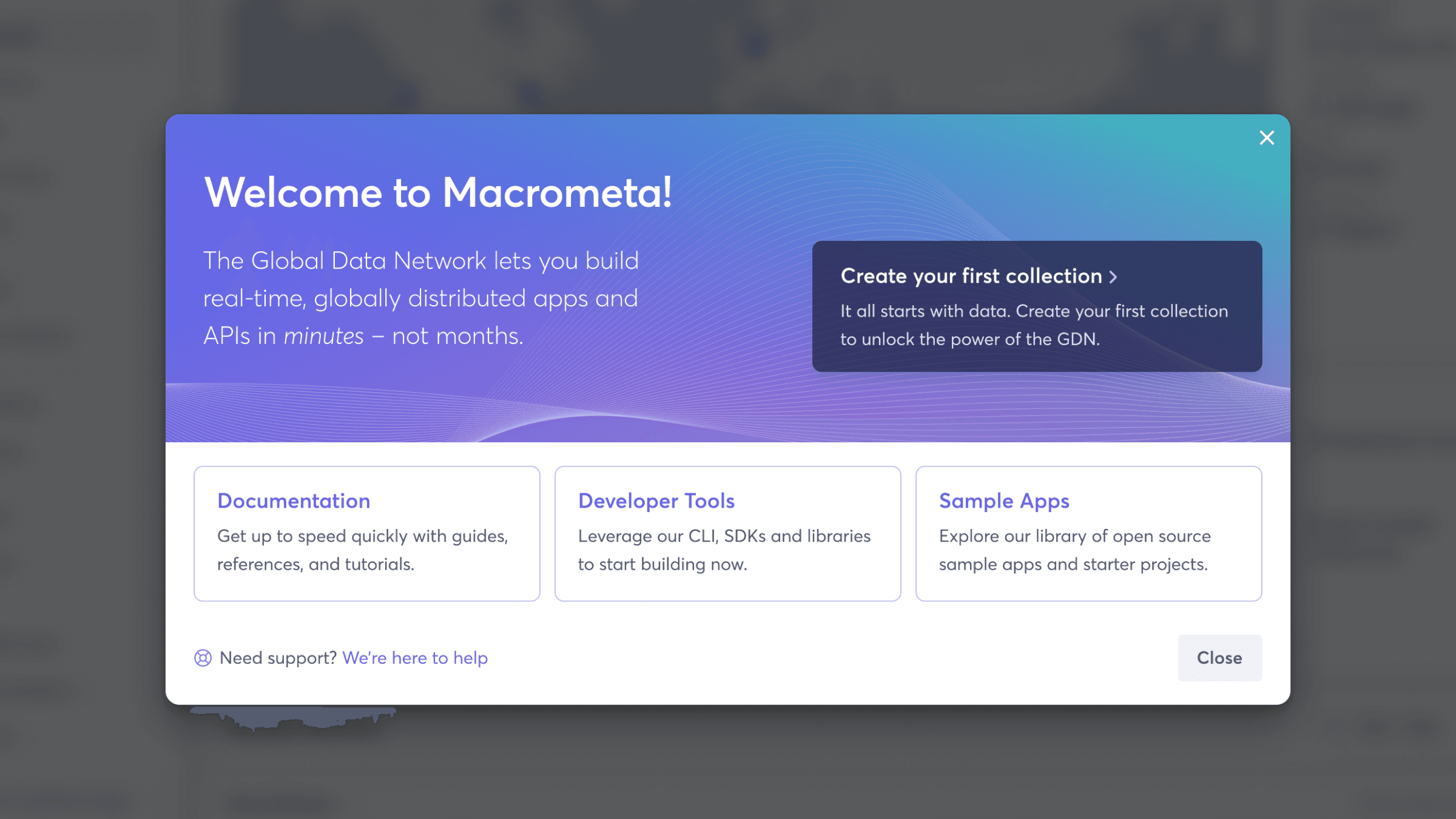
The following is a high-level sampling of several views from this effort. I won't be going into the nuts-and-bolts process of developing any one artifact or deliverable. If you want to talk shop, please get in touch.


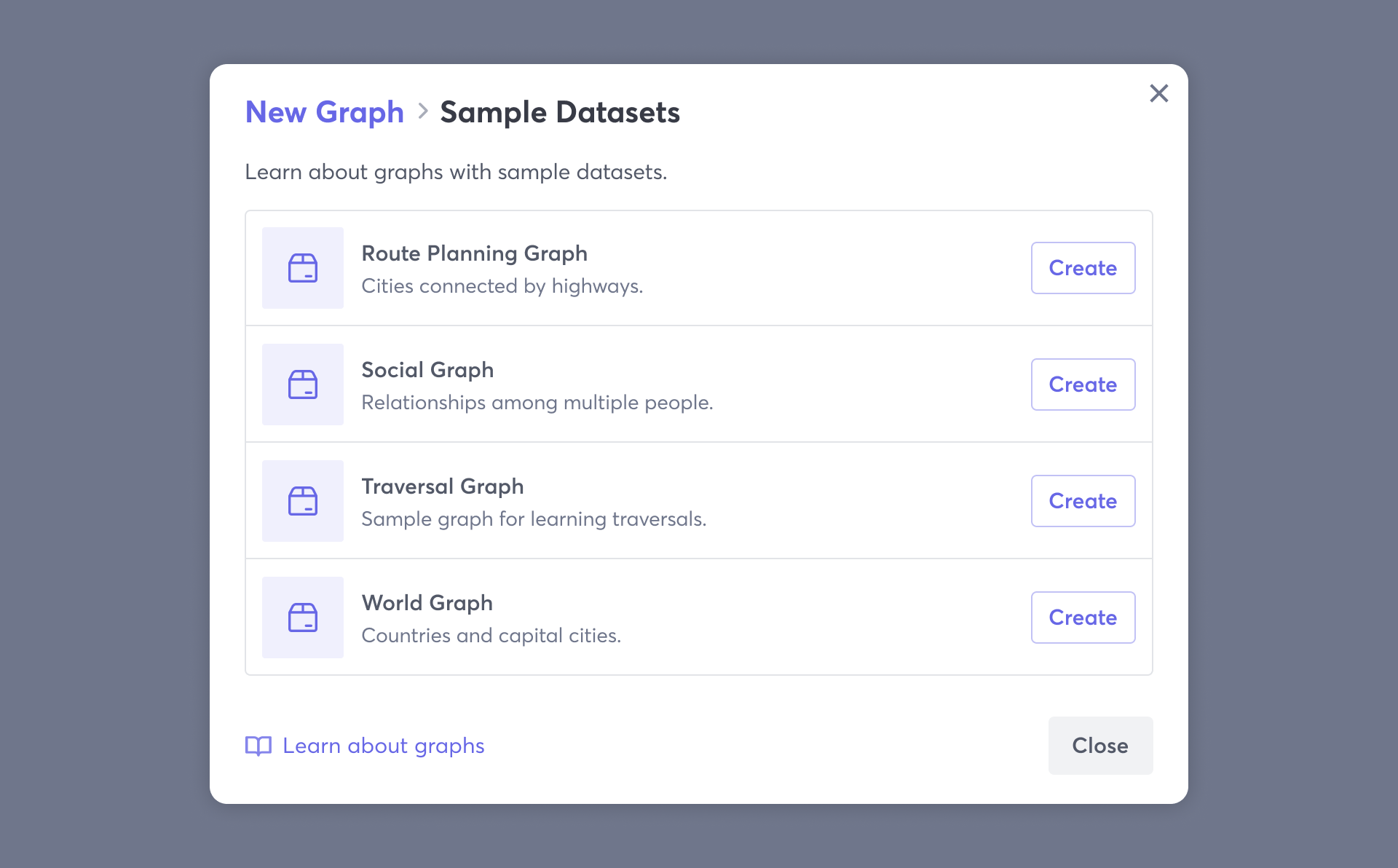

Overall, this effort has been quite successful.
- Design velocity – Macrometa's small design team produces a substantial volume of high quality work in support of a large, fast-moving engineering organization and an ever-evolving platform.
- Engineering velocity – Macrometa's web engineering team is able to quickly and reliably deliver high quality work that meets design requirements and expectations with minimal revisions.
- Brand System Continuity – Every product interface conforms to Macrometa's brand system and design system standards, delivering cohesive, high quality, and familiar experiences at every touchpoint.
I'm proud of what we created and what it has enabled, and I know my colleagues across the company share that sentiment as well.
